





Development
What Is Mobile-First Design and Why Does It Matter?
- Published
- 13 August 2025
- Reading time
- 4 min read
- By
- Mateo Jakelic
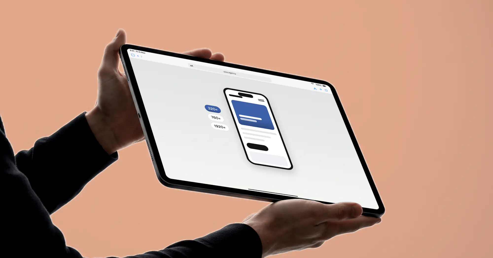
With around half or more of global web traffic now on mobile, mobile-first design isn't a choice, it's a necessity. Fast load times, intuitive touch navigation, and clear content all depend on it, and so do your search rankings. Design mobile-first and every user sees your brand clearly, whatever the screen.
If your website isn't built mobile-first, you risk a poor experience for a large part of your audience, often the majority. With so much web traffic now coming from phones, mobile-first design isn't a nice-to-have, it's the foundation everything else sits on.
What is mobile-first design?
Mobile-first design means designing your content for mobile screens first, then scaling up to larger ones, rather than shrinking a desktop design down to fit a phone. It follows the principle of progressive enhancement: start with the core content and functionality that works on the smallest screen, then add to it for tablets and desktops.
This is the opposite of the old approach, where sites were built for desktop and squeezed onto mobile as an afterthought, usually with bloated code and cramped layouts as the result. Starting small forces clarity: priority content up front, simple navigation, tap-friendly controls, and faster pages.
Why mobile-first matters now
The numbers make the case on their own. Mobile devices account for around 50 to 60% of global web page views, depending on the source and the month, far more than a decade ago. In some markets, including Austria, desktop is still slightly ahead, so check your own analytics. People increasingly browse, shop, and interact with brands from their phones, so for many businesses the mobile experience is the main one.
It's not just about reach, it's about behaviour. A large share of visitors abandon a site that takes more than about three seconds to load on mobile, and visitors expect a site to work well on their phone. A slow or awkward mobile site doesn't just irritate users, it quietly costs you trust and conversions.
Mobile-first and SEO
There's a direct search angle too. Google uses mobile-first indexing, meaning it predominantly uses the mobile version of your site to crawl, index, and rank it. If your mobile experience is thin or slow, your rankings suffer, regardless of how good the desktop version looks. Speed is part of this, which is one more reason we treat performance as a feature, and it ties directly into the basics of what SEO actually is.
When desktop still matters
Mobile-first doesn't mean desktop is irrelevant. For complex dashboards, data tools, and detailed workflows, desktop remains critical, and in some industries like finance or enterprise software, desktop still dominates daily usage. The point isn't to abandon desktop, it's to design from the constraint up rather than the comfort down. For most B2C and creative brands, though, mobile is the front door.
Why we build mobile-first
- Builds are lighter, faster, and easier to maintain
- Clients get better SEO performance and stronger usability
- A scalable foundation works beautifully across every screen size
Frequently asked questions
What does mobile-first design mean?
Designing for the smallest screen first and then enhancing for larger ones, rather than designing for desktop and shrinking it down. It prioritises core content, speed, and touch-friendly layouts.
Is mobile-first the same as responsive design?
Not quite. Responsive design adapts a layout across screen sizes, but it often starts from desktop. Mobile-first is a responsive approach that begins with the mobile view, which usually produces leaner, faster results.
Why is mobile-first important for SEO?
Google uses mobile-first indexing, so it ranks your site based primarily on the mobile version. A fast, well-built mobile site directly supports better rankings.
Does mobile-first mean ignoring desktop users?
No. It means building from mobile up so the experience is solid everywhere. Desktop still matters, especially for complex tools, and a mobile-first foundation scales up cleanly.
The bottom line
With so much web traffic now on phones, mobile-first design is a necessity, not a choice. Fast load times, intuitive touch navigation, and clear content all depend on it, and so do your search rankings. Design mobile-first and every visitor sees your brand clearly and efficiently, whatever screen they're on.
Want your site rebuilt mobile-first? Get in touch and we'll make it happen.